
Menu


Get Sales Advice from Mon - Fri 9am - 5:00pm:
020 3337 8950LAST UPDATED: January 27, 2026
Display Quality on 10-Inch Tablets: What Really Matters for Your Eyes
Display quality is one of the most important parts of the tablet experience, yet it is often misunderstood. When comparing devices, numbers like resolution and refresh rate are easy to focus on, but 10 inch tablet display quality is really about how comfortable the screen feels during long sessions of reading, streaming, gaming, or creative work.
This guide breaks down what genuinely matters for your eyes, covering panel types, sharpness, colour accuracy, and eye-comfort features. Whether you are buying your first tablet or trying to choose the right display for an upgrade, this will help you make sense of the specs without the marketing noise.
LCD vs OLED on Tablets
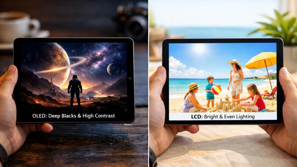
The first major decision affecting display quality is panel type. Most 10-inch tablets use either LCD or OLED, and each has clear strengths depending on how the tablet is used.
Contrast and Black Levels
OLED panels are known for their deep blacks and high contrast. Each pixel can switch off completely, which improves shadow detail and makes dark scenes in films look more immersive.
LCD panels cannot achieve true black levels in the same way, but modern LCDs still offer strong contrast for everyday use. For reading, browsing, and general apps, the difference is noticeable but not always critical.
When comparing LCD vs OLED tablet screens, contrast matters more for media consumption than for productivity tasks.
Brightness and Outdoor Visibility
Brightness plays a bigger role than contrast when using a tablet in bright rooms or near windows. Many LCD tablets can sustain higher brightness levels across the whole screen, which helps with outdoor or well-lit use.
OLED panels often look more vibrant indoors, but sustained brightness can be lower to protect panel longevity. For users who read or browse in varied lighting, brightness consistency can matter more than panel type.
Battery and Longevity Considerations
OLED panels can be more power-efficient when displaying darker content, but they may use more battery at high brightness levels. LCD displays are generally more predictable in long-term performance and do not carry the same risk of image retention.
For users keeping a tablet for several years, panel longevity is worth considering alongside image quality.
Resolution and Pixel Density Basics
Resolution numbers look impressive on spec sheets, but sharpness depends on how the tablet is actually viewed.
"Sharp Enough" for Reading and Browsing
On a 10-inch screen, Full HD and above is usually sharp enough for reading text, browsing the web, and watching video without visible pixelation.
Beyond a certain point, higher resolutions offer diminishing returns. For most users, clarity and scaling matter more than raw resolution numbers.
Pixel Density and Viewing Distance
Tablet pixel density only improves perceived sharpness if you sit close enough to see the difference. Most people hold a 10-inch tablet at a comfortable viewing distance where very high pixel densities offer little practical benefit.
This is why mid-range tablets can still feel crisp during everyday use.
Scaling and Text Clarity Settings
Operating system scaling settings have a major impact on clarity. Proper text scaling improves readability far more than pushing resolution higher.
Adjusting font size and display scaling is one of the simplest ways to improve eye comfort, especially during long reading sessions.
Colour Accuracy for Streaming vs Creative Work
Colour performance affects both enjoyment and accuracy, depending on how the tablet is used.
Colour Profiles and Saturation Differences
Some tablets favour vivid, saturated colours that look great for films and games but are less accurate. Others offer more neutral colour profiles that prioritise realism.
For general use, vibrant colours are often more enjoyable. For editing photos or drawing, accuracy matters more.
Streaming-Focused Display Needs
For streaming, contrast, saturation, and brightness consistency are more important than perfect accuracy. This is where many users notice the biggest difference in display quality for streaming and gaming, especially when watching films or live sports.
High-quality HDR support can enhance highlights, but only if the panel brightness supports it properly.
Creative Work Needs and Stylus Comfort
Creative users benefit from accurate colour reproduction and consistent brightness across the screen. Stylus comfort is also affected by surface texture and glare control.
If drawing or design is a priority, it is worth looking at our guide on the best screens for drawing to understand which display characteristics support creative workflows.
Eye-Comfort Modes and Brightness Settings

Comfort matters just as much as image quality, particularly for extended use.
Blue-Light Filters and Night Modes
Blue-light filters reduce the amount of short-wavelength light emitted by the display. While they do not eliminate eye strain entirely, many users find them helpful during evening use.
A blue light filter tablet mode is especially useful for reading or browsing before bed.
Brightness and Auto-Brightness Behaviour
Auto-brightness adjusts screen brightness based on ambient light. When tuned well, it prevents unnecessary strain caused by screens being too bright or too dim.
Manually setting brightness too high is one of the most common causes of eye fatigue.
Refresh Rate Comfort and Flicker Sensitivity
Higher refresh rates can make scrolling feel smoother, but they are not essential for eye comfort. More important is flicker control, particularly at low brightness levels.
Most users will not notice refresh rate differences during reading, but gamers and fast scrollers may appreciate smoother motion.
Glossy vs Matte Screens and Real-World Reflections
Display quality is not just about the panel underneath. The surface finish plays a big role in how comfortable a screen feels in everyday environments.
Glossy Screens for Vibrancy and Contrast
Most 10-inch tablets use glossy glass displays. These enhance contrast and colour saturation, making films and games look more punchy. This works well indoors and in controlled lighting.
However, glossy finishes reflect light easily, which can cause glare near windows or under bright lamps. This is often mistaken for poor brightness when it is actually reflection.
Matte Finishes and Screen Protectors for Reduced Glare
Matte displays are rare on tablets, but matte screen protectors can reduce reflections significantly. They scatter light, making the screen easier to see in bright rooms and outdoors.
The trade-off is slightly reduced sharpness and contrast. For users who read a lot or work near windows, glare reduction can improve comfort more than extra brightness.
Viewing Angles and Shared Screen Comfort
Viewing angle performance affects how a tablet looks when shared or positioned casually, not just when viewed head-on.
Viewing Angles for Family and Group Use
Good viewing angles ensure colours and contrast remain consistent when the screen is tilted or viewed from the side. This matters when watching videos with others or placing the tablet on a stand.
Most modern tablets perform well here, but cheaper panels may lose contrast or shift colours at wider angles.
Stand Use and Screen Consistency
When using a tablet on a stand for streaming, video calls, or desk use, viewing angle stability becomes more noticeable. A screen that holds brightness and colour across angles feels more comfortable and less distracting.
This is particularly relevant for tablets used as shared home devices.
How Display Settings Change Battery Life and Performance
Display choices do not just affect visuals. They also influence how long your tablet lasts between charges.
Brightness and Refresh Rate Impact on Battery
Higher brightness and elevated refresh rates increase power consumption. Users chasing maximum smoothness or brightness may notice shorter battery life during streaming or gaming.
Balancing brightness and refresh rate often delivers better long-term comfort than maxing out both.
Dark Mode and Interface Choices
Dark mode can reduce power usage on OLED displays and lower eye strain in dim environments. On LCD screens, the battery impact is smaller, but visual comfort benefits still apply.
Choosing the right interface theme complements eye-comfort settings and extends session length.
Display Calibration and Default Settings: Should You Change Them?
Many tablets ship with display settings designed to look impressive on shop shelves rather than during long-term use.
Factory Settings vs Real-World Comfort
Out-of-the-box settings often favour high saturation and brightness. While eye-catching, they can cause fatigue over time.
Adjusting colour temperature, brightness, and contrast slightly usually results in a more natural and comfortable viewing experience.
When Calibration Matters and When It Doesn't
Professional calibration is unnecessary for most users. Simple tweaks to warmth, saturation, and scaling offer the biggest comfort improvements.
For creative users, ensuring colour profiles are set correctly matters more than fine calibration.
Touch Responsiveness and Display Feel in Everyday Use

Display quality is not only about how a screen looks, but how it feels to interact with. Touch responsiveness plays a subtle but important role in eye comfort and overall usability, especially during long sessions of reading, scrolling, or note-taking.
Touch Sampling and Responsiveness
Touch sampling rate determines how frequently the screen registers touch input. A higher and more consistent sampling rate makes interactions feel immediate and fluid, even on displays with standard refresh rates.
In everyday use, good touch responsiveness improves:
- Scrolling through articles and social feeds
- Typing on on-screen keyboards
- Navigating menus and switching apps
This is why two tablets with similar specs can feel very different in real-world use. A responsive screen reduces the need for repeated gestures, which in turn lowers visual and physical fatigue.
Writing, Scrolling, and Gesture Comfort
For reading and handwriting, consistency matters more than raw speed. Smooth scrolling without micro-stutters helps the eyes track text more naturally, while reliable touch detection prevents missed taps or uneven movement.
Stylus users benefit even more from accurate touch tracking. Lag or inconsistent response can interrupt handwriting flow and make note-taking or sketching feel tiring over time.
A display that responds predictably to touch often feels more comfortable, even if its headline specs are modest.
How Displays Change Over Time and What That Means for Comfort
Display quality is not static. Understanding how screens age helps set realistic expectations and maintain eye comfort over long-term ownership.
Brightness Drop and Colour Shift Over Time
All displays slowly change with use. Brightness can decrease gradually, and colour temperature may shift slightly, particularly on devices used at high brightness for long periods.
LCD panels tend to age evenly and predictably, while OLED displays can show uneven wear if static elements, such as navigation bars or status icons, are displayed constantly at high brightness. This does not happen quickly, but it is worth considering for long-term use.
These changes are usually subtle, but over several years they can affect how comfortable a screen feels.
How to Maintain Display Comfort Long Term
Good habits help preserve both visual quality and comfort:
- Avoid using maximum brightness unless necessary
- Enable auto-brightness to adapt to changing light
- Use eye-comfort or night modes during evening use
- Adjust colour warmth gradually if the screen feels harsh over time
These small adjustments help maintain a comfortable viewing experience and reduce strain as the display ages.
Conclusion
When it comes to 10 inch tablet display quality, comfort and consistency matter more than chasing the highest specs. Panel type, brightness behaviour, text scaling, and eye-comfort features all have a greater impact on daily use than resolution numbers alone.
OLED displays excel at contrast and immersive media, while LCD panels offer reliable brightness and long-term stability. For reading, streaming, and everyday tasks, a well-tuned display with good scaling and eye-comfort modes often matters more than the underlying technology.
By focusing on how you actually use your tablet, rather than marketing claims, you can choose a screen that feels better on your eyes and more enjoyable over time.
FAQs
Is OLED better than LCD on a 10-inch tablet for eye comfort?
Not always. OLED offers better contrast, but LCD panels can provide more consistent brightness, which some users find more comfortable.
What resolution is sharp enough on a 10-inch tablet screen?
Full HD and above is sharp enough for most users at normal viewing distances.
Does higher pixel density help with reading on a tablet?
Only up to a point. Proper text scaling and brightness settings have a bigger impact on readability.
Do blue-light filters and eye-comfort modes actually help?
They can reduce discomfort during evening use, especially when combined with lower brightness.
What display settings improve streaming and gaming quality?
Balanced brightness, accurate colour profiles, and consistent contrast improve both streaming and gaming experiences.
You can pay with:
*PayPal Credit Representative Example: Assumed credit limit £1,200, Representative 23.9% APR (variable). Purchase rate 23.9% p.a (variable).Terms & Conditions apply.

PayPal Credit and PayPal Pay in 3 are trading names of PayPal UK Ltd, 5 Fleet Place, London, United Kingdom, EC4M 7RD. Terms and conditions apply. Credit subject to status, UK residents only, Five Tech LTD acts as a broker and offers finance from a restricted range of finance providers. PayPal Pay in 3 is not regulated by the Financial Conduct Authority. Pay in 3 eligibility is subject to status and approval. 18+. UK residents only. Pay in 3 is a form of credit. Check if affordable and how you will repay. May make other borrowing more difficult or expensive. See product terms for more details.
Copyright © 1996-2026 Fivetech LTD | Terms and Conditions
box.co.uk & Box are trading names of Five Tech Limited. Registered office: Box LTD, Unit 10 Woodford Trading Estate, Woodford Green IG8 8HF